Purple Bouquet Color Palette
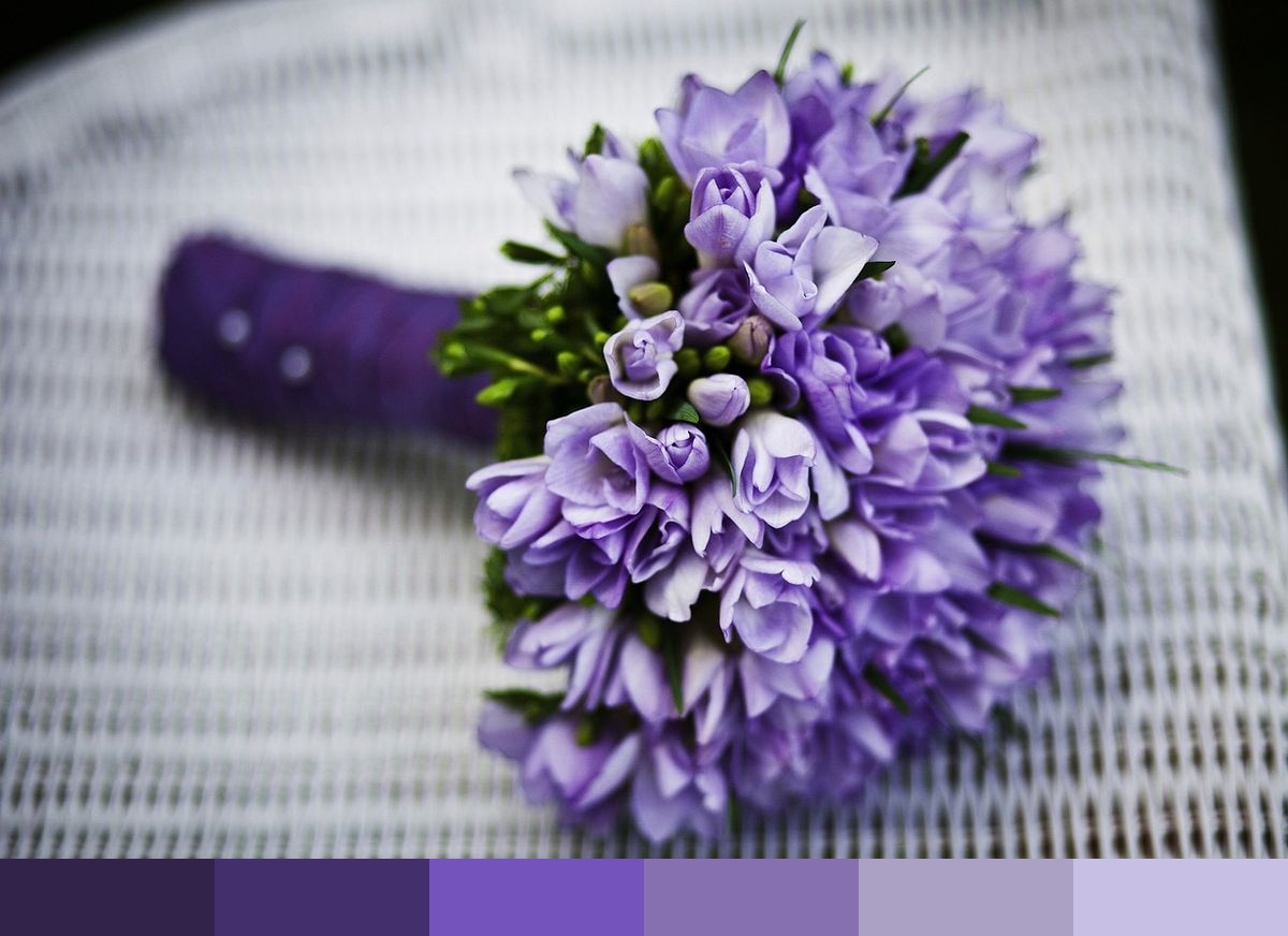
This palette is drawn from a close-up photograph of a dense purple flower bouquet — the type found at weddings and formal floral arrangements, composed entirely of richly toned purple blooms packed tightly together in full flower. The photograph frames the flowers closely, letting the variations within a single hue family carry the entire composition: from near-black indigo deep in the shadowed interior of the bouquet through to the pale lavender of the outermost, fully lit petals. The result is a rare single-hue natural palette that spans nearly the full value range of purple from a single real-world source.
Credit: virandek on Pixabay
Colors in This Palette
The six shades — indigo (#32234B), amethyst (#432F6B), violet (#7454BC), violet 2 (#8670B0), violet 3 (#AAA1C5), and lavender (#C8C0E4) — form a tight monochromatic gradient from deep indigo-purple through saturated mid-violet to pale orchid. Because they originate from the same photograph, each shade sits in a perfectly natural tonal relationship with the others — they don’t clash or feel arbitrary even when used side-by-side at full intensity, because the light source that created them was real and consistent.
Sponsors
Purple palettes of this tonal completeness are difficult to construct manually because the natural desaturation that occurs across values — the way purples grey toward blue-grey as they lighten — is very hard to replicate artificially. The photo origin gives these shades an organic authenticity that makes them especially effective for luxury beauty and cosmetics branding, wedding and event design, editorial fashion, premium packaging, fragrance identity, and any creative work where sophistication, romance, and a sense of elevated quality are all required simultaneously.
The deep indigo and amethyst are excellent structural and background colors for design systems where saturated dark purple — rather than neutral black or navy — is the desired foundation. The mid-range violet tones carry brand and interactive accent roles naturally. The pale violet and lavender tones function beautifully as card surfaces and light-mode backgrounds that retain a sense of brand personality. This palette can power an entire brand color system without any additional colors.