Wedding Rings Splashing Color Palette
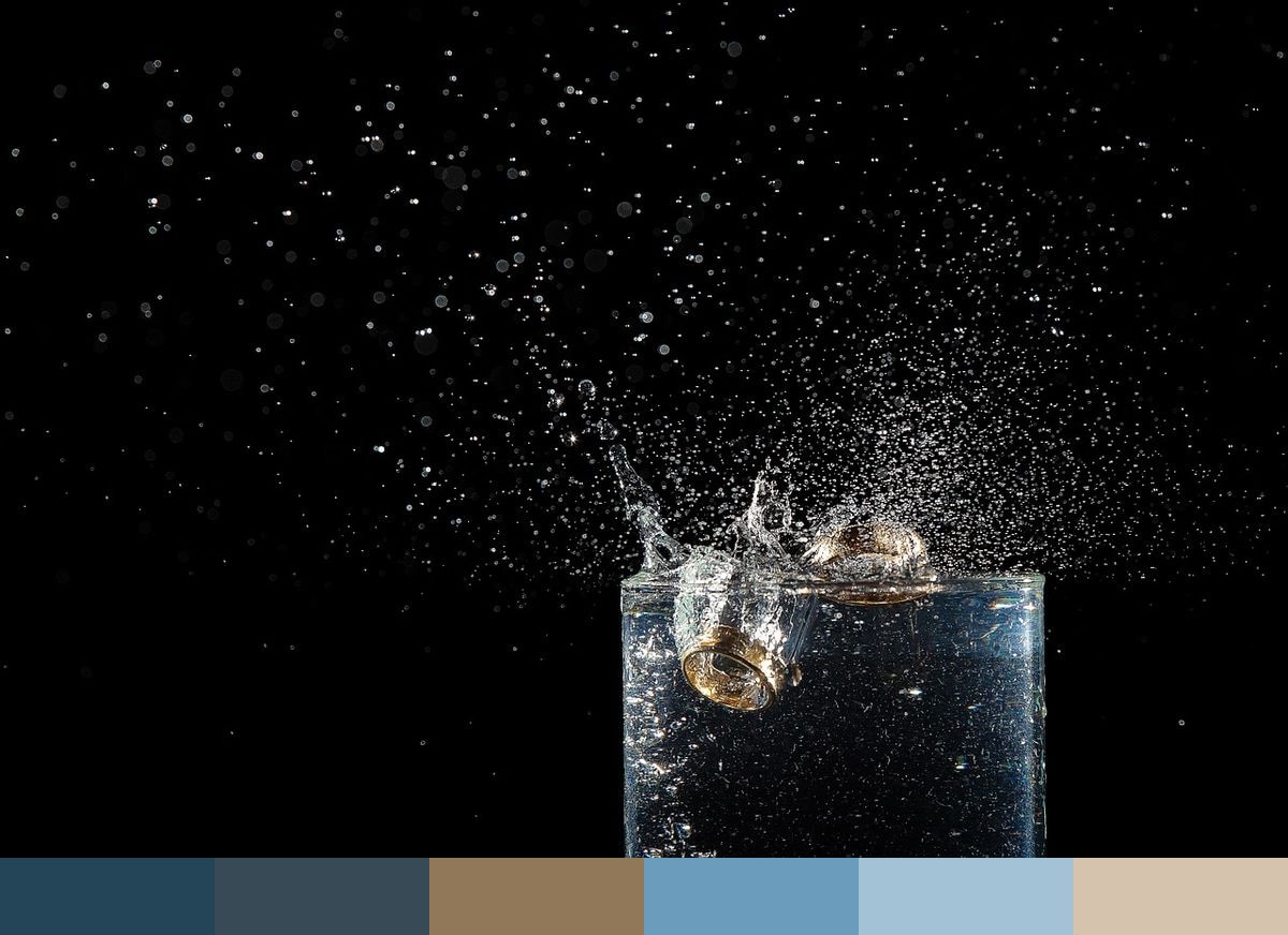
A pair of wedding rings rest submerged in dark water, a splash frozen in close-up — the kind of dramatic macro image that takes a familiar symbol and renders it almost abstract. The deep, near-black water produces the two cerulean tones that anchor this palette, while the ring metal itself contributes the warm amber and apricot shades. The soft sky blue and powder blue come from the subtle scatter of light through the water's surface. Together, these six colors form an unexpectedly rich palette that balances cool depth with warm metallic accents.
Credit: jeanborges on Pixabay
Colors in This Palette
The palette spans from the near-darkness of deep cerulean — almost a dark teal-navy — through progressively lighter blues to powder blue and apricot. The amber sits as the warmest point, providing contrast against the cooler tones and evoking the gleam of gold or rose gold ring metal. This interplay of cool and warm is what makes the palette feel dynamic rather than monotone. Cerulean 2 and cerulean, while similar, offer slightly different undertones that add dimensionality to any composition built from this set.
Sponsors
For wedding design work, this palette works particularly well for luxe or editorial aesthetics — think deep navy invitations with gold foil, or ceremony programs with cerulean ink on ivory stock. The amber and apricot tones pair naturally with warm metallic accents in gold or champagne, making this palette a strong choice for couples who want something a step beyond the typical soft blush-and-ivory wedding aesthetic.
In jewelry branding and product photography, these colors translate directly — the cerulean tones are ideal for website backgrounds or editorial spreads featuring rings and fine metals. The warm amber and powder blue pairing also works well for cosmetics, lifestyle, and spa brands that want to communicate a sense of quiet luxury.