Wedding Reception Flowers Color Palette
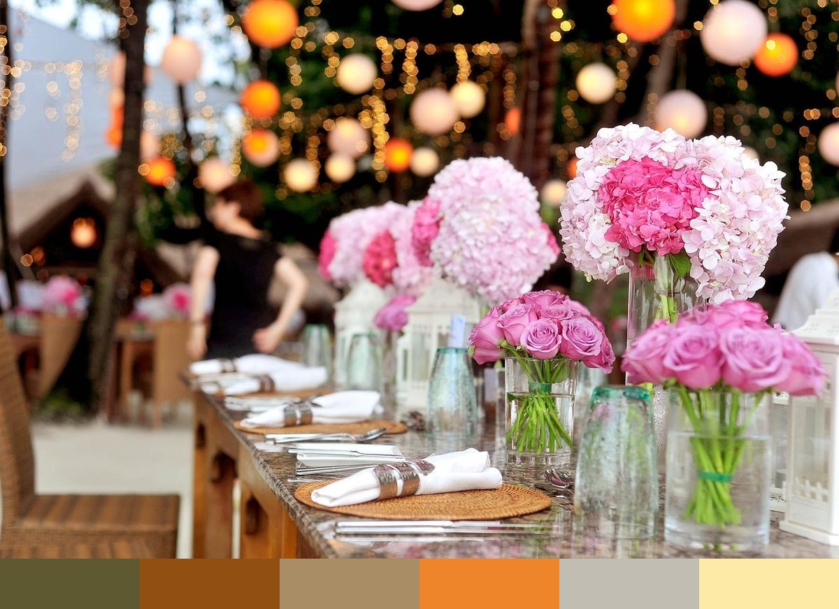
A wedding reception table is set with dramatic floral centerpieces that burn with orange, amber, and rust-toned blooms under warm event lighting. The photograph captures not just the flowers but the entire table arrangement — candles, vessels, and linens all contributing to the warm amber atmosphere. This palette draws the full range from dark bronze-olive at the base through vivid burnt orange, soft amber highlights, and out to the pale golden straw where the brightest light falls.
Credit: Pexels on Pixabay
Colors in This Palette
This is a fully warm palette with no cool tones — every shade from dark bronze through orange amber to pale straw occupies the warm half of the color wheel. The range is wide despite being contained within warm territory, making the palette functional for compositions that need both depth and luminosity without crossing into cool or neutral territory. The vivid burnt sienna-orange at the center of the palette is likely drawn from the flowers themselves at peak saturation under the event lighting.
Sponsors
This palette is perfectly calibrated for autumn and fall weddings. The orange, amber, and straw tones echo the season's most iconic colors — turning leaves, harvest pumpkins, warm lanterns, and dried botanical arrangements. Table settings and reception decor in these shades feel abundant, celebratory, and seasonal. The bronze darker tones add sophistication that prevents the palette from reading as too rustic or casual.
Beyond weddings, this set is versatile for any warm, abundance-themed event or brand: Thanksgiving table settings, harvest festival branding, food and beverage packaging, and organic product design. In interior design, the amber and straw tones work beautifully in kitchens and dining spaces, particularly alongside raw wood and natural stone textures. The deep bronze sits comfortably as an accent wall or cabinet color in spaces with golden hardware and warm lighting.