Wedding day in the park Color Palette
A married couple walks together in a park on their wedding day, the lush grass and dappled sunlight converting the setting into an almost entirely warm-yellow-green scene. This palette captures exactly that — two bronze greens from the grass and foliage, a warm amber from the mid-light tones, a golden-chartreuse from the sunlit lawn, a dry terracotta beige from paths or stone nearby, and a soft straw-yellow from the brightest lit areas. It is a palette built from summer light filtering through a park, golden and organic in character.
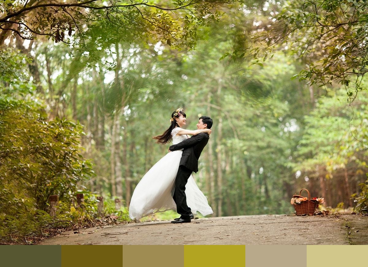
Credit: toanmda on Pixabay
Colors in This Palette
This is a palette of warm yellows and olives spanning six carefully graduated shades. The two bronze greens at the deep end are close in value but distinct in undertone — one leaning slightly greener, the other more golden-brown. Amber deepens and warms the progression, gold introduces the first clearly yellow note, and terracotta and straw round out the high end with sandy, dry warmth. The entire palette sits comfortably on the warm side of the spectrum, with no cool tones present.
Sponsors
For weddings, this palette is a natural fit for late-summer or early-autumn ceremonies. Gold and straw tones pair beautifully with white and ivory, and the bronze greens evoke the natural setting of garden or park events. Table settings in these shades feel abundant and botanical, especially when paired with seasonal florals and warm wooden venues.
In graphic and interior design, this golden-olive palette is enjoying a strong moment as part of a broader interest in earthy, nature-forward aesthetics. The bronze greens work as wall colors in living rooms or entryways, amber and gold as accent ceramics or candle tones, and straw as a natural fiber or textile complement. The palette translates directly to fall fashion, harvest-themed editorial work, or any project requiring warmth without red or orange.