Wedding Day Couple Color Palette
A married couple stands outdoors on their wedding day, surrounded by the natural environment of a garden or open landscape. The earthy olive-bronze tones are drawn from the foliage and ground, the rust and warm gold from the bride's bouquet and the warm afternoon light, and the gentle powder blues from a soft, cloudy sky behind them. Despite the presence of green on both ends of the palette, the overall feel is warm and romantic, grounded in a natural outdoor setting.
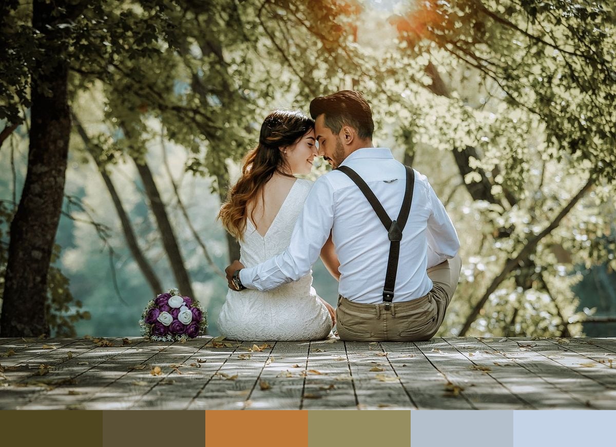
Credit: OlcayErtem on Pixabay
Colors in This Palette
This palette pairs warm earthy tones with cool sky-inspired blues in a way that feels natural rather than forced. The bronze and umber provide depth, the rust and gold lend warmth, and the two powder blues create openness and balance. It is the kind of palette you see in outdoor settings where the natural world provides the color blocking — green grass and earth below, sky above, with warm light cutting through the middle.
Sponsors
For wedding and event design, this palette suits spring and early summer outdoor ceremonies. The powder blues work well for paper goods and linen details, while the gold and rust tones are natural choices for floral arrangements, candles, and centerpiece accents. The olive bronze grounds stationery suites or signage that might otherwise feel too airy.
In interior and product design, this combination of earthy greens, warm amber, and soft blue translates to spaces with a relaxed, natural style — think linen sofas in powder blue, terracotta planters and ceramics, and botanical prints on warm ivory backgrounds. The palette also works naturally in kitchenware, lifestyle photography, and garden-inspired brand identities.