Wedding couple in a field Color Palette
A married couple walks or stands together in an open field, the warmth of the landscape and the glow of natural light producing this earthy, romantic palette. Deep olive bronze at the darkest point captures the densest foliage or shadow, umber follows as a rich warm brown, amber moves toward a sun-lit golden tone, red appears as a warm earthy hue from the dry grasses or the couple's attire, and peach and terracotta carry the lighter, warmer tones of the scene. The whole palette has the quality of late-afternoon light in a field — warm, golden, and full.
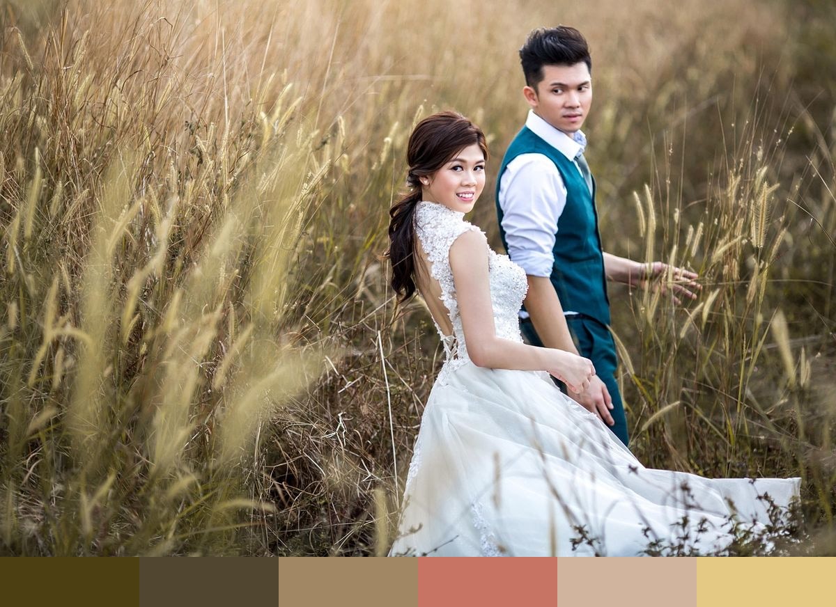
Credit: sonamabcd on Pixabay
Colors in This Palette
The palette spans the earthy warm spectrum from deep olive bronze through umber and amber to a warm red, then lightens into peach and terracotta. Bronze and umber together create a grounded, slightly gray-inflected warm base, while amber and the red introduce golden and earthier warmth. The peach and terracotta at the lighter end are more overtly warm orange-pink in character, reflecting the warm light falling on the couple and the surrounding field. Together, the six shades cover the full warm mid-tone range with no cool notes present.
Sponsors
This palette naturally suits outdoor and rustic wedding settings — vineyard ceremonies, countryside elopements, meadow-based events, and golden-hour portrait sessions. The bronze and umber tones work well in printed stationery against warm ivory or cream stock, while the amber and peach tones translate beautifully to florals and textile choices. Terracotta has become one of the most searched interior and event design colors of recent years, and this palette provides a full supporting range around it.
In brand and product design, this warm field-inspired palette communicates authenticity, natural origins, and a grounded sense of place. It suits farm-to-table food brands, outdoor lifestyle products, sustainable fashion labels, and any brand that wants to evoke the warmth of the natural world without relying on green. The neutral amber and umber tones are versatile enough to serve as base colors in a larger design system, with peach and terracotta as accents.