Sunflowers in Vase Color Palette
This palette is extracted from a photograph of a bouquet of bright yellow sunflowers arranged in a vase. The bold, large-headed blooms fill the frame with their signature combination of golden-yellow petals radiating out from deep brown centers, while green stems and the soft background provide earthy contrast at the base of the palette. Shot in natural light, the yellows carry a warm, glowing quality — rich and alive rather than the flat brightness of a studio shot.
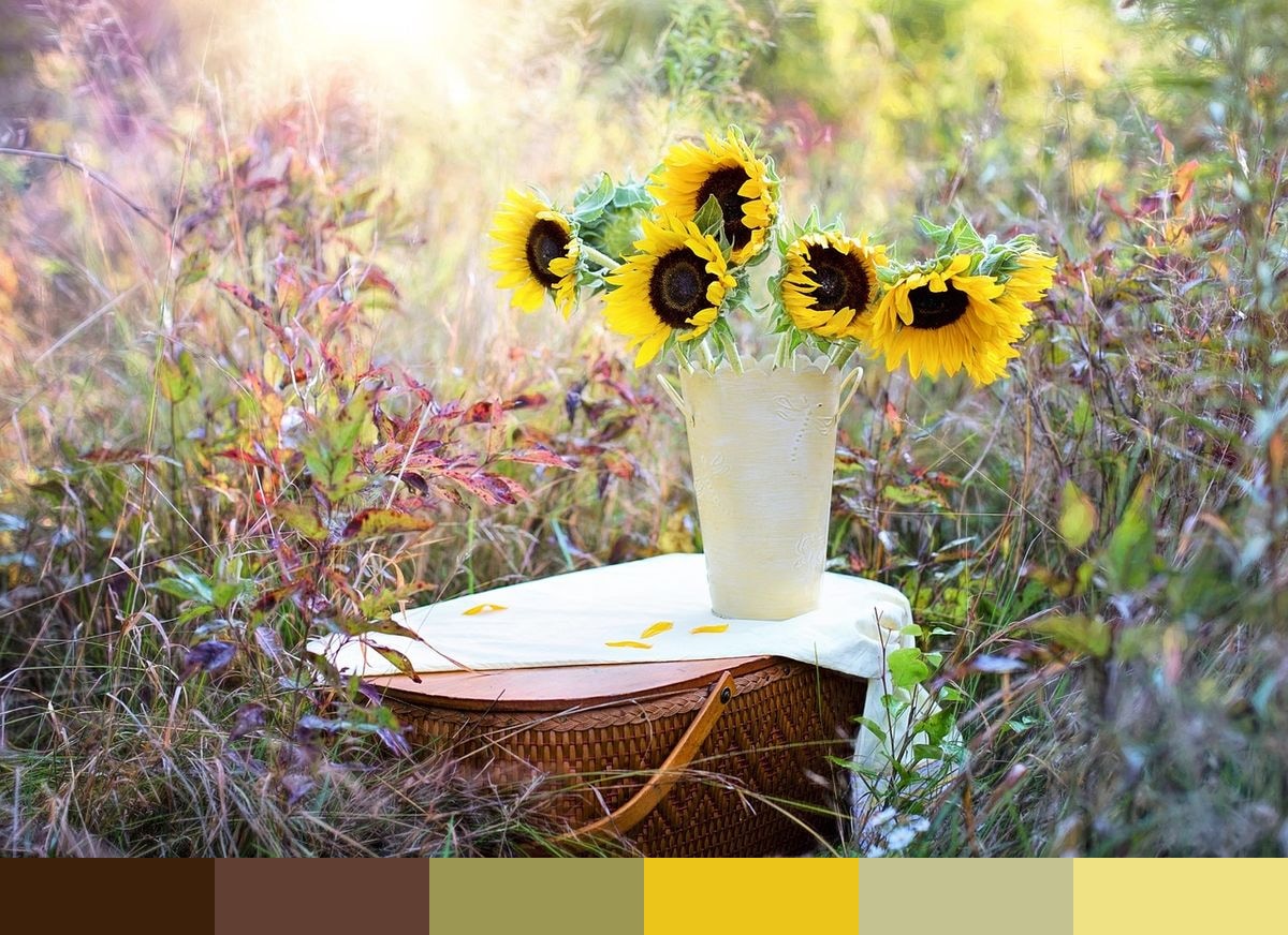
Credit: JillWellington on Pixabay
Colors in This Palette
The six shades — russet (#3C2009), rust (#614033), gold (#9C9853), gold 2 (#ECC51B), straw (#C5C292), and straw 2 (#EEE285) — move from the deep brown of sunflower centers and stems through the characteristic bright yellow of the petals to the pale, bleached straw tones of the lightest highlights. The dark russets reflect the rich, complex brown rings at the heart of the bloom; the two gold tones capture the petals at different light levels; the straw shades carry the delicate warmth of the background and petal tips.
Sponsors
This sunflower palette is a natural fit for summer seasonal campaigns, farm-to-table and farmers market branding, sunflower-themed home décor and stationery, warm-toned wedding and event design, and any creative project that needs to immediately read as bright, cheerful, and grounded in nature. The deep russet and rust tones give the palette an earthy quality that keeps the bright yellows from feeling flat or artificial.
Use the two gold tones as your dominant palette colors when energy and warmth are the primary goals; bring in the dark russets as anchoring neutrals for type and structural copy areas. The straw shades make excellent background fills — they carry genuine warmth without competing with the more saturated focal colors. This is one of the few naturally-sourced palettes that pairs equally well against both black and white.