Spring Snowdrop Flowers Color Palette
This palette is drawn from a photograph of snowdrops (Galanthus) — the small, nodding white bell-shaped flowers that are typically among the very first to emerge each spring, often pushing up through the last patches of snow. The image features a dense cluster of snowdrops in a naturalistic setting of early-season greenery and forest-floor texture: pale stems, emerging leaves, fallen plant matter, and the diffused light of late winter. It is the backdrop and surroundings — rather than the white blooms themselves — that drive this palette, producing a muted, earthy set of greens, silvers, and warm neutrals that captures the mood of the season’s turning.
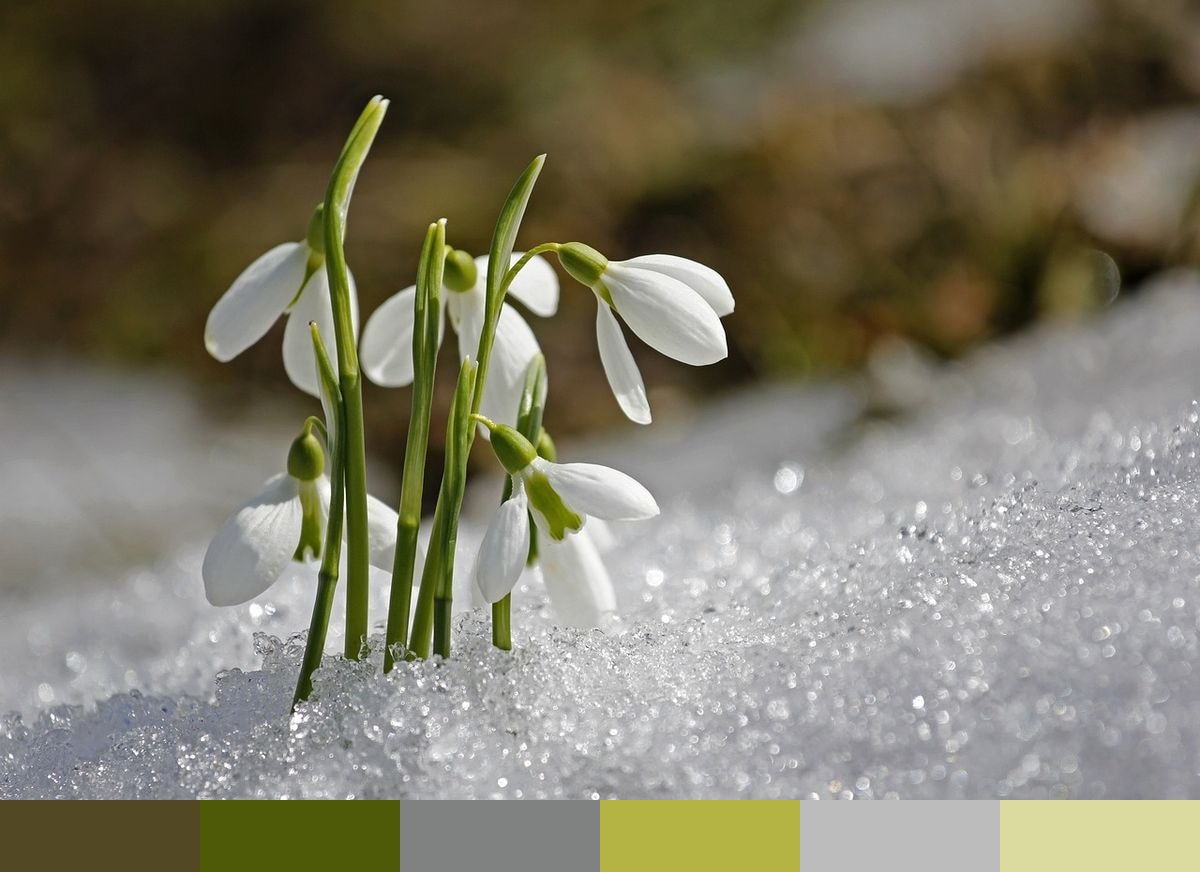
Credit: sunflair on Pixabay
Colors in This Palette
The six shades — umber (#534824), moss (#4F5A08), stone (#808181), gold (#B4B444), silver (#BBBCBB), and straw (#DBDB9F) — are drawn from the stems, leaves, soil, and ambient light of a scene at the precise moment of seasonal transition. The deep umber reflects the rich organic matter at the base of the stems; the dark and mid greens come from the emerging foliage and plant material; the stone and silver tones capture the pale flat light of late winter; the warm gold and straw record the first hints of sunlight working back into the landscape after months of cold.
Sponsors
Palettes like this are distinctive because they capture a transition — the quiet moment between seasons — rather than the full saturation of summer or the deep neutrals of winter. The resulting colors feel simultaneously still and vital, which makes this palette highly effective for wellness and mindfulness branding, early-spring seasonal campaigns, botanical stationery and paper goods, sustainable and eco-focused product identity, and any creative work that wants to evoke renewal and quiet optimism rather than bold, declarative brightness.
The umber and moss tones work as natural structural and text colors for organic and nature-adjacent design systems where pure black reads as too industrial or modern. The stone and silver tones are ideal neutral background colors — they carry the pale quality of winter light without reading as cold or sterile gray. The gold and straw shades provide gentle warmth and function naturally as accent and highlight colors throughout. The full palette pairs cleanly with pure white, natural linen, and unbleached paper tones.