Rose on Black Background Color Palette
This palette is drawn from a dramatic close-up of a red rose set against a pure black background. The stark, high-contrast composition strips away everything except the flower itself — petals range from near-black maroon in the deepest folds to vivid fire-engine red at the outer edges, with warm brownish-rust tones in the shadowed mid-range of the bloom. The black background lets every grade of red express itself fully, producing a palette that is simultaneously rich, bold, and precise.
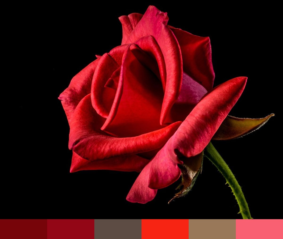
Credit: Josch13 on Pixabay
Colors in This Palette
The six shades — mahogany (#770408), crimson (#930615), rust (#5C4C44), red (#F72414), rust 2 (#997859), and red 2 (#F96071) — span the full tonal range of a single red rose under dramatic lighting. The deep maroon tones represent the shadows deep within the petal folds; the bright, saturated reds capture the fully-lit outer petals; the warm rust and tan tones occupy the naturally-lit mid-range of the bloom where overlapping petals soften the contrast.
Sponsors
Red palettes sourced from nature carry a nuance that studio-mixed reds rarely achieve: the organic variation of real light on a real subject gives each shade an underlying warmth and complexity. This palette is particularly effective for Valentine's Day and romance campaigns, luxury cosmetics and beauty branding, wine and spirits packaging, wedding and event design, and any project that calls for unambiguous passion and intensity.
The darker mahogany and crimson tones are especially useful as structural colors in design systems where deep red — rather than black — is the desired foundation. Use the vivid red and pink-red as high-attention accent and interactive colors. Pair the full palette against pure black or off-white to let the rich midtones read at their full depth.