Pink Flamingo Color Palette
This palette is drawn from a photograph by Beto_MdP of a Chilean flamingo (Phoenicopterus chilensis) — a South American species noted for its warm peachy-pink and orange-red coloration, which contrasts with the cool tropical pinks of the more familiar greater flamingo. The image captures the bird's vivid plumage in natural light, where the coral-red wing feathers deepen to sienna and russet in shadow, and warm to a bright orange-vermilion in direct sun.
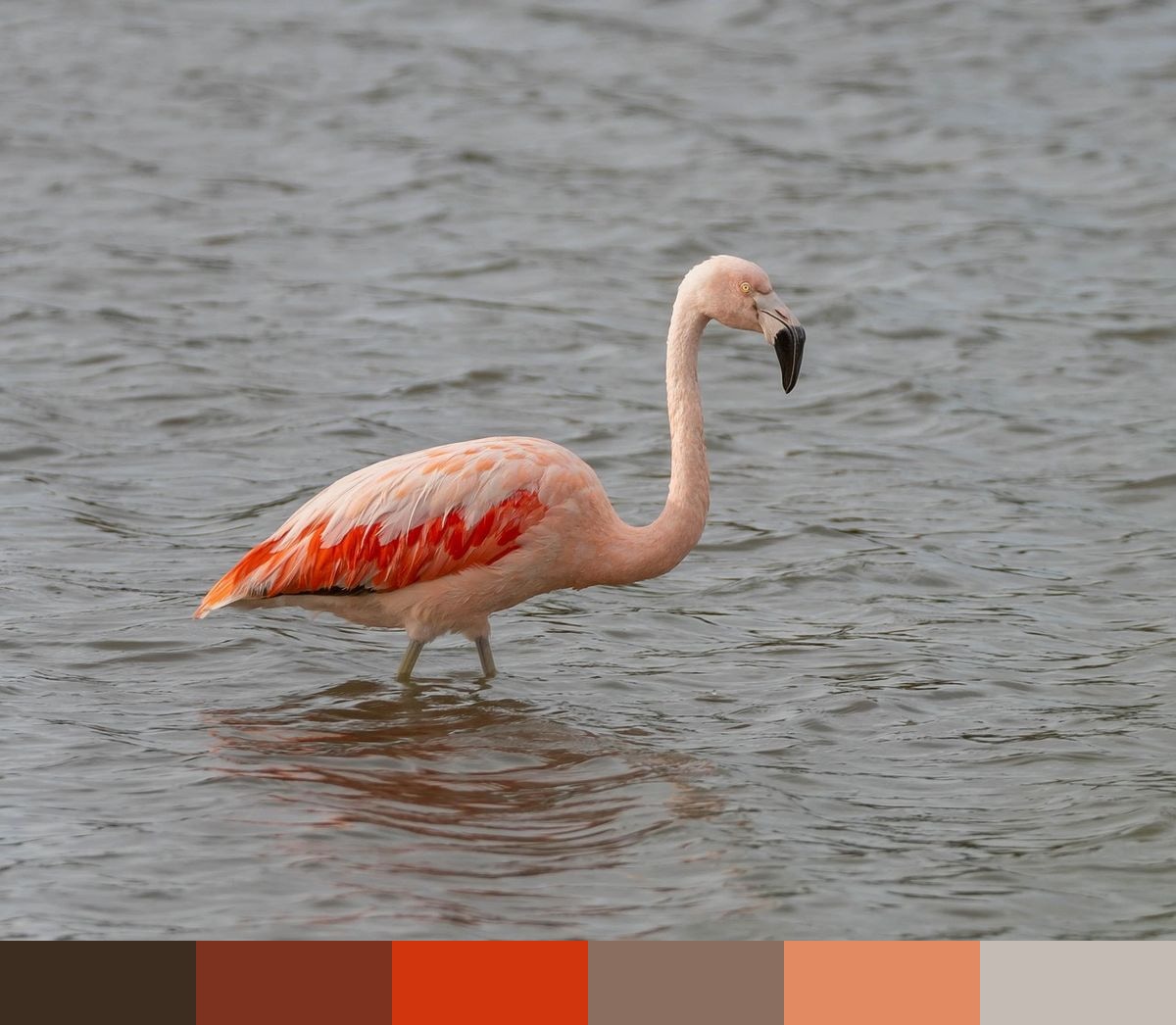
Credit: Beto_MdP on Pixabay
Colors in This Palette
The six shades — dark russet (#3C2D20), deep sienna (#7D311F), vivid red-orange (#D1350E), warm rust (#8A6E5F), burnt sienna (#E28A61), and pale apricot (#C4BCB4) — are an entirely warm, coral-and-terracotta range. Unlike the cooler flamingo palette from NickyPe, this one skews decidedly toward orange-red rather than pink, with the vivid #D1350E being the standout accent — a confident, traffic-stopping coral-red that sits just between orange and red.
Sponsors
This palette is ideal for summer lifestyle, hospitality, and Mediterranean-inspired design. The coral-red (#D1350E) and burnt sienna (#E28A61) catch the eye immediately and suit high-energy brand touchpoints like CTAs, promotional banners, and packaging. The three darker shades — russet, sienna, and russet-brown — provide the weight and depth to keep the composition from feeling too bright or seasonal-only.
The pale apricot (#C4BCB4) is the palette's lightest tone and reads almost as a warm neutral — close to the shade of unbleached canvas or parchment. Use it liberally as a body background or text field tint to preserve warmth without overwhelming the composition. Pair the full palette against natural materials — wood, terracotta tile, raffia — for an interior or editorial direction that references the warm wetlands of South America.