Guinea Fowl Color Palette
This palette comes from a close-up portrait of a helmeted guinea fowl — the striking West African gamebird best recognized by its bony casque, bare blue-gray facial skin, and pearl-spotted slate plumage. In the photograph, warm chestnut and sienna tones dominate the neck and wattles, while the background fades to a cool powder-blue haze. The combination of earthy warmth and cool gray-blue makes this a surprisingly versatile nature palette.
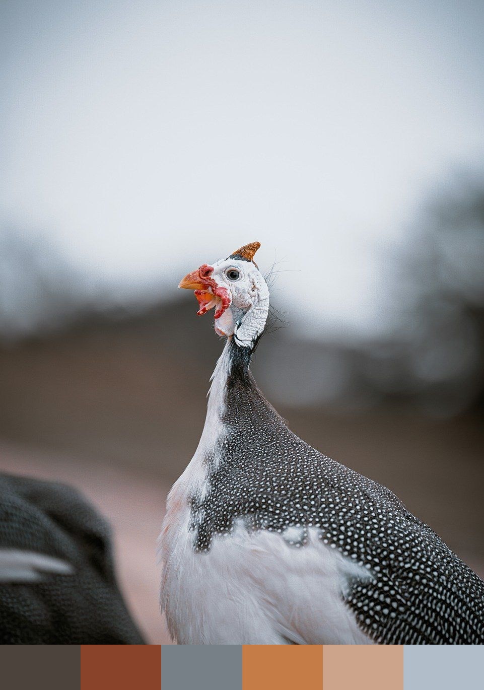
Credit: RonaldPlett on Pixabay
Colors in This Palette
The six shades — russet (#4C433C), rust (#89432B), stone (#777F87), burnt sienna (#C67C46), tan (#CCA48C), and powder blue (#B1BEC9) — capture the guinea fowl's characteristic mix of warm earth tones and cool blue-gray. The dark russet and rust anchor the palette as shadow and mid tones from the bird's spotted plumage and neck wattles, while the three lighter values move from warm amber into the cool blue-gray of the sky and skin.
Sponsors
This palette works well in interior and textile design where an earthy, organic warmth is needed without leaning fully beige. The contrasting temperature between the amber-brown group (#89432B, #C67C46, #CCA48C) and the cool gray-blue group (#777F87, #B1BEC9) gives the palette natural tension and balance — a quality that lends itself to rustic branding, safari-inspired packaging, outdoor lifestyle brands, and artisan ceramics.
The powder blue (#B1BEC9) is the palette's surprise accent — a desaturated sky tone that keeps the composition from feeling too warm and heavy. In practice it functions well as a background or large-area color, allowing the richer rusts and siennas to read as focal points. Pair all six tones against natural linen or unbleached cotton to replicate the organic, open-air feel of the original photograph.
Palettes drawn from photographs are useful when you need colors that feel grounded rather than arbitrary. These shades work well for brand identity, illustration, UI color systems, mood boards, and any project where you want color that feels rooted in the natural world.