Fashion Bridal in Field Color Palette
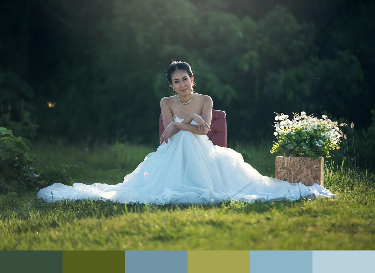
An Asian bride stands outdoors in a wide open field, her white wedding gown catching the afternoon sun against a backdrop of deep green grass and open sky. This palette is extracted directly from that scene — the rich hunter greens and mossy tones of the landscape, soft blues from the sky, a warm gold from the ambient light, and pale powder blue from where the sky meets the horizon. Six colors drawn together by the same photograph, each one grounded in the real environment of the wedding day.
Credit: sasint on Pixabay
Colors in This Palette
The six colors in this palette — hunter green, moss, sky blue, gold, sky blue 2, and powder blue — reflect the full tonal range of a lush outdoor wedding scene. The two greens anchor the palette with an earthy depth, while the three blue-toned shades move gradually from mid-tone sky blue through to soft powder. Gold sits as the warm counterpoint, drawn from the glow of natural afternoon light. These hues share tonal relationships that make them easy to combine without the palette feeling forced or artificial.
Sponsors
This palette is well-suited to wedding stationery — invitations, programs, menus, and envelope liners. The hunter green and powder blue pairing has become a popular combination in modern wedding branding, particularly for outdoor or garden ceremonies. A gold accent for calligraphy or foil printing adds a celebratory shimmer that keeps the palette from reading too rustic.
For interior design and home decor applications, the cooler shades — sky blue, powder blue, and moss — translate naturally to textiles, tile, and paint selections in spaces that benefit from calm and openness. Hunter green works particularly well as a statement wall color paired with natural wood or rattan accents.
In digital and brand design, consider pairing hunter green and powder blue for primary and supporting tones in a brand identity, with gold used sparingly for highlights or iconography. The palette reads as sophisticated, nature-forward, and universally appealing for lifestyle, wellness, or event-based brands.