Egret Color Palette
This palette is drawn from a dramatic wildlife photograph by terski (shot on a Canon EOS R5 at 600mm, f/11) of an egret captured in flight with wings fully extended. The white bird itself is almost absent from the palette — instead the palette captures the rich tonal range of the sky and water behind the bird: a deep umber shadow in the foreground, then a gradient of blue-gray through slate-blue, powder blue, and a pale, washed periwinkle representing the open sky above the bird's outstretched wings.
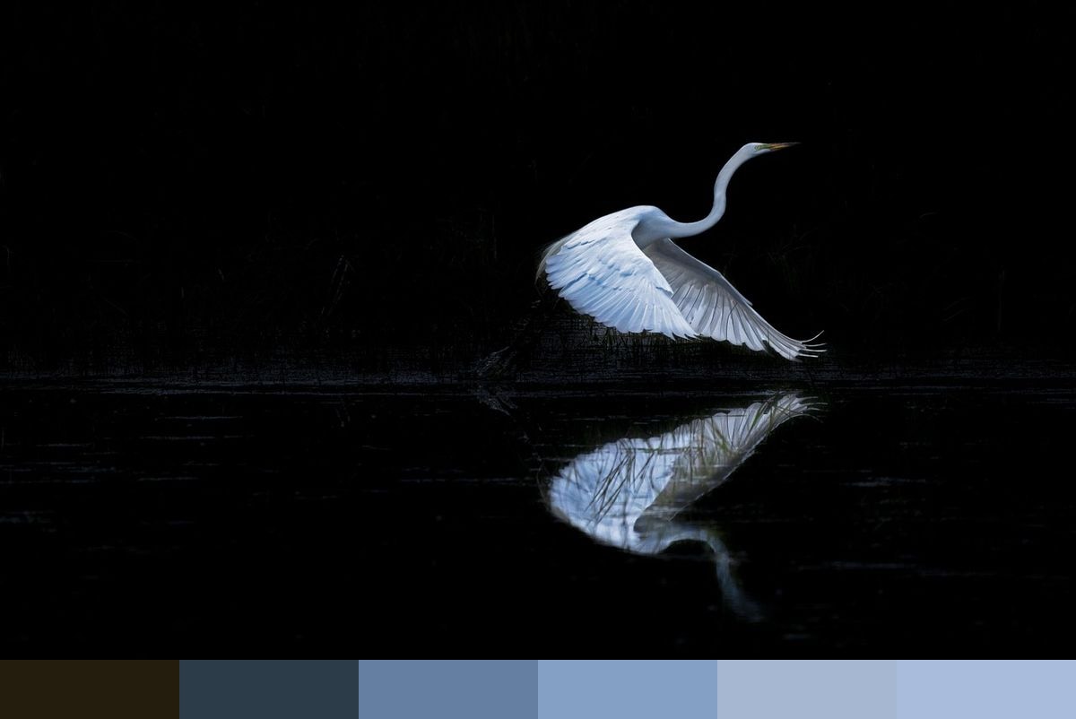
Credit: terski on Pixabay
Colors in This Palette
The six shades — umber (#241C0C), dark teal-blue (#2C3C48), slate-blue (#647FA1), medium sky blue (#85A0C5), powder blue (#A6B8D1), and pale periwinkle (#A9BCDC) — form a near-perfect tonal gradient from dark to light. This graduated quality makes the palette ideal for use in watercolor-inspired illustration, atmospheric poster design, and sunrise or twilight color schemes. The deepest umber (#241C0C) provides the necessary dark anchor while the four blues above it create a natural layering of sky tone.
Sponsors
This palette is particularly well-suited to wellness, meditation, and mental health design where calm and openness are key emotional targets. The absence of warm tones keeps the palette cool and serene. In interior design contexts, these six shades translate directly into a coastal or lake-house palette — deep navy trim, graduated blue-gray walls, and pale periwinkle ceiling or textiles.
The four blue tones (#647FA1, #85A0C5, #A6B8D1, #A9BCDC) are close enough in value to read as a cohesive family but distinct enough to create tonal structure. Use the darkest (#647FA1) for typography and UI elements, the medium tones for body and card backgrounds, and the palest periwinkle for large open areas. The umber (#241C0C) works as a rich, warm-dark alternative to black for text on light backgrounds.