Bride and groom standing together Color Palette
A bride and groom stand together in formal wedding attire, the composition close enough that their clothing, skin tones, and the warm ambient light become the primary color story. Deep mahogany from shadowed fabric folds, russet and rust from the mid-tones, a vivid red from the warmest highlights, and the soft peach and rose of skin in flattering bridal photography light. It is a fully warm palette, intimate and close, drawn from the human-centered composition of a formal wedding portrait.
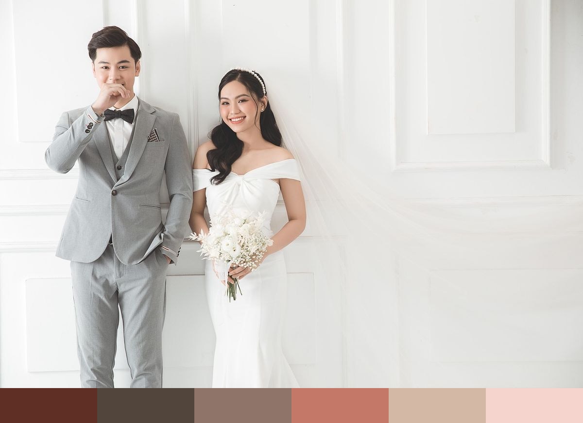
Credit: tientoanmaimai10 on Pixabay
Colors in This Palette
This palette spans a warm range from deep mahogany through the reds to a delicately pale rose. The dominant shades are the mid-range tones — russet, rust, and red — which give the palette its warmth and vibrancy. Mahogany at the darkest end provides substantial depth without going fully achromatic, and the peach and rose at the light end offer versatile, skin-adjacent tones that soften compositions. Despite the presence of red, the palette reads as romantic rather than aggressive, because of the tonal graduation and the softening effect of peach and rose.
Sponsors
For wedding design, this palette suits a romantic, warm aesthetic that is distinct from the typical cool blush-and-greenery trend. It works naturally in candlelit or warm-lit reception spaces, where the deep mahogany and rust tones feel intentional rather than accidental. Velvet napkins in deep red or mahogany, paired with peach floral and warm ivory linens, create a rich, layered tablescape.
In beauty, portrait, and fashion design, this warm range communicates confidence, romance, and femininity. It is well suited to cosmetics brand palettes, editorial headshots, and lifestyle campaigns where warmth and personality are the central messages. The palette also performs well in UI design for beauty and fashion brands, where rich, warm tones communicate luxury without relying on gold metallics.