Bride and groom sitting together Color Palette
Newlyweds sit together after the ceremony — the warm, relaxed golden light of the setting and the soft fabrics of bridal wear producing a palette that feels serene and sun-drenched. Rust at the darkest point anchors the composition, followed by two graduated amber tones that carry the core warmth of the scene, then a dusty terracotta that is slightly drier in tone, and out to two soft apricots at the pale end that glow with honeyed light. This is a palette entirely at home in warmth and ease, without a single cool or tense note.
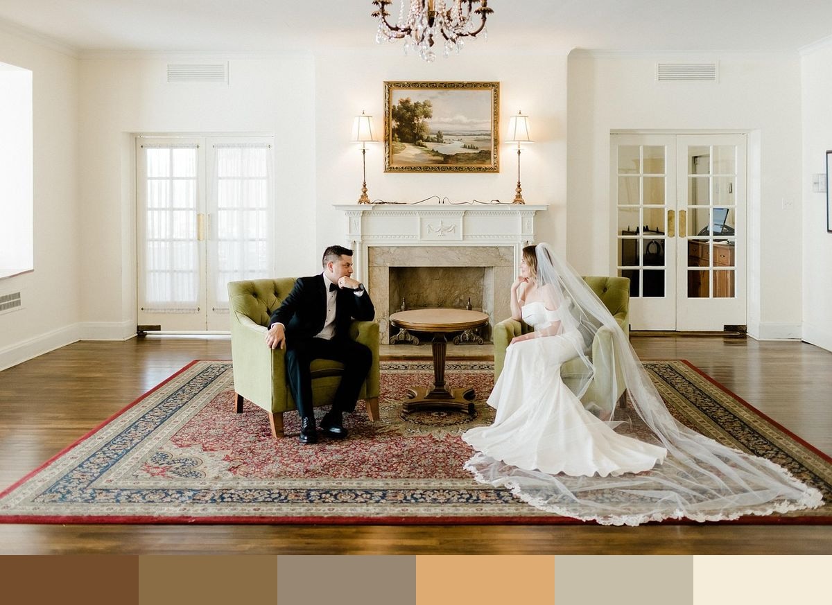
Credit: ohalek00 on Pixabay
Colors in This Palette
This palette moves through rust, two ambers, terracotta, and two apricots in a smooth, all-warm progression with very little tonal jump between any pair of adjacent shades. The graduation is what makes the palette special — every shade feels closely related to its neighbors, producing a set that blends naturally whether layered or used across different design elements. The apricots at the light end are pale enough to function as near-neutrals while still clearly belonging to the warm palette family.
Sponsors
For weddings, this golden amber range is a natural fit for sunset ceremonies, vineyard settings, and candlelit receptions. The amber and terracotta center tones have become enormously popular in contemporary tablescaping and event design, especially when paired with white and ivory linens. The soft apricot shades are versatile enough to work in printed materials, where they read as warm cream under certain lighting conditions and as a defined soft color under others.
In interior design, this palette translates directly to a warm, golden-hour living aesthetic. Amber and apricot tones on walls, upholstered furniture, or curtains create spaces that feel perpetually bathed in afternoon light, making them particularly valued in rooms with north-facing windows or limited natural light. For product and packaging design, the palette communicates natural ingredients, artisan production, and a warm human touch.