Bridal bouquet Color Palette
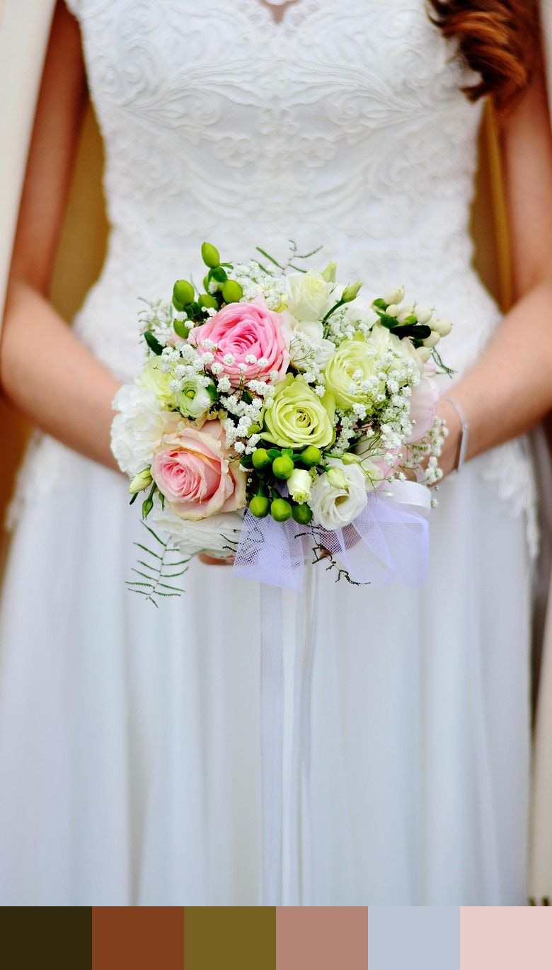
A beautifully composed bridal bouquet photographed up close reveals a surprisingly earthy, complex color story. The deep olive-umber tones come from dense foliage and stems, while the rust and warm sienna hues are drawn from the flowers themselves — dried or tonal florals with a vintage warmth. The pale periwinkle, an unexpected element, catches scattered cool light, and a soft dusty rose rounds out the palette. Together these six shades form a botanical mix that feels romantic without being sweet.
Credit: congerdesign on Pixabay
Colors in This Palette
What makes this palette distinctive is the interplay between warm and cool tones — the olive-umber greens and earthy reds sit on one side of the spectrum, while the soft periwinkle introduces a cool counterpoint that keeps the palette from reading as too warm or monolithic. The dusty rose at the lightest end ties the warm and cool sides together, making this set surprisingly versatile despite its earthy origins.
Sponsors
For wedding design, this palette suits a more editorial or countryside aesthetic — less traditional, more curated. It works well for florals-forward themes, where the olive and umber tones mirror natural greenery and dried botanicals. Periwinkle as an accent color on menus, seating cards, or ribbon details adds a refined, unexpected touch that elevates the overall look.
In branding and packaging, a palette like this communicates quality, craft, and natural origins. It is well suited to organic skincare, artisan food products, botanical illustration, and floral businesses. The deep umber anchors any brand mark, while periwinkle and rose provide a range of accent options depending on the season or product line.