Blue Tit Color Palette
This palette is extracted from a close-up wildlife photograph by Max_Gindele_Photography showing a blue tit and nuthatch perched together on a winter branch. The blue tit's unmistakable cobalt-blue cap and wings dominate the palette, while the dark olive-bronze tones come from the bark and the bird's back plumage. The sky and background blur into cool silver-gray and periwinkle, giving the palette its characteristic cool, calm quality.
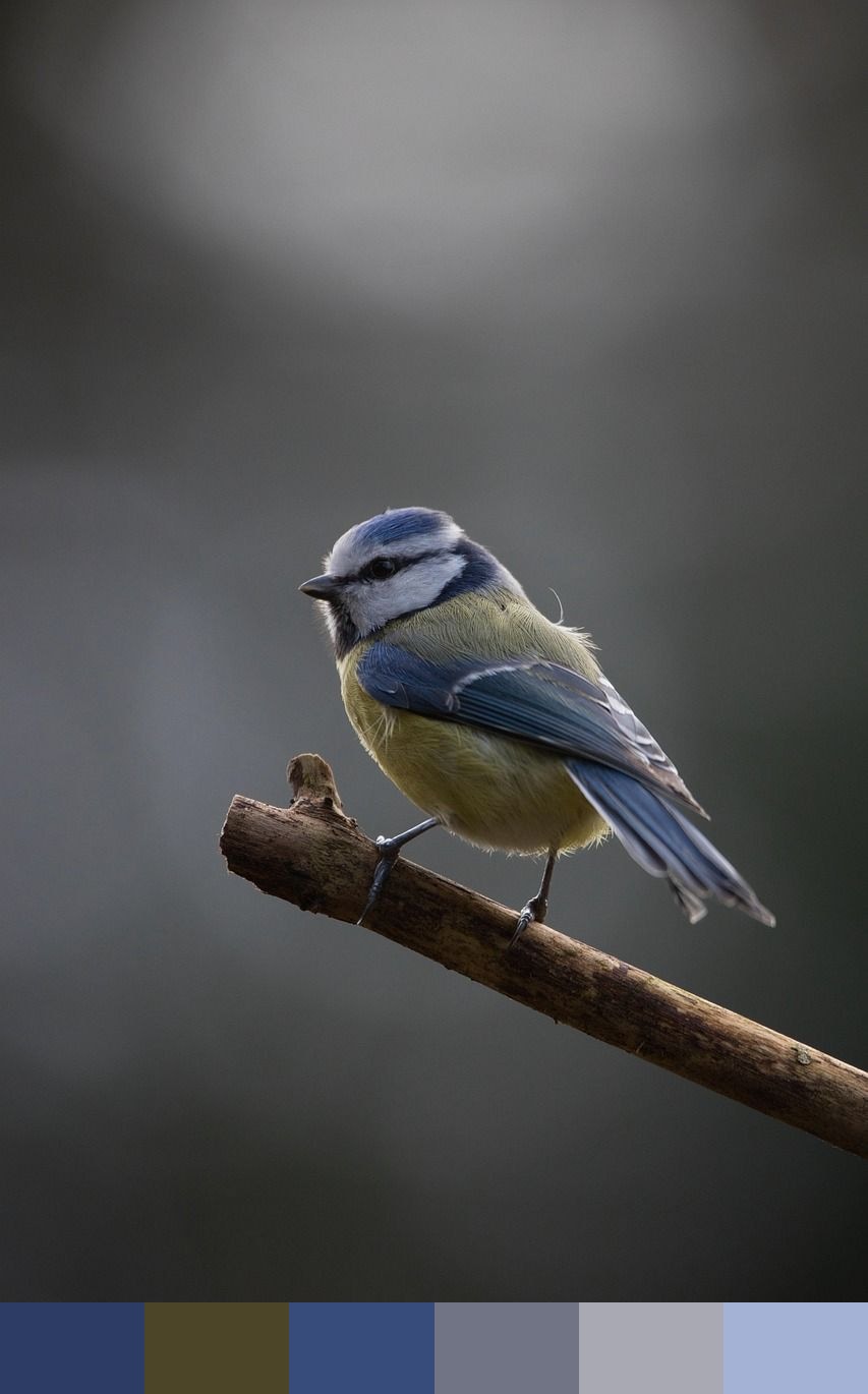
Credit: Max_Gindele_Photography on Pixabay
Colors in This Palette
The six shades — dark cobalt (#2C3C64), olive-bronze (#4D4527), bright cobalt (#384C7C), slate-blue (#707485), silver-gray (#A8A9B2), and periwinkle (#A4B2D6) — are dominated by cool blue-gray tones with a single warm counterpoint in the olive-bronze. The two deep blue values (#2C3C64 and #384C7C) are close but distinct — the first leans toward the muted blue of deep shadow, the second is cleaner and brighter, closer to the bird's vivid cap color in direct light.
Sponsors
This is an excellent palette for tech, finance, and professional services branding where a cool, trustworthy tone is needed without arriving at a generic corporate navy. The olive-bronze (#4D4527) provides enough warmth to keep the palette from feeling cold or sterile, and works especially well as a hover or accent color against the cobalt tones. Together the six shades also suit ceramic illustration, botanical design, and science communication.
The pale periwinkle (#A4B2D6) and silver-gray (#A8A9B2) are ideal as large-area background or surface colors. They provide visual breathing room while keeping the composition tonally consistent with the deeper cobalt anchor shades. Pair the full palette with white type and generous whitespace for a clean Nordic or Scandinavian design aesthetic.