Blue Liverflower Color Palette
This palette is drawn from a photograph of blue hepatica (Hepatica nobilis), also known as liverflower — a delicate early-blooming wildflower native to European temperate forests and one of the first flowers to appear in spring. The image captures clusters of vivid blue-violet blossoms with pale centers arranged in a glass vase, surrounded by fresh green leaves and stems. The pairing of the intense azure flower color with the lush green foliage creates a clean, natural complementary contrast that drives the distinctive quality of this palette.
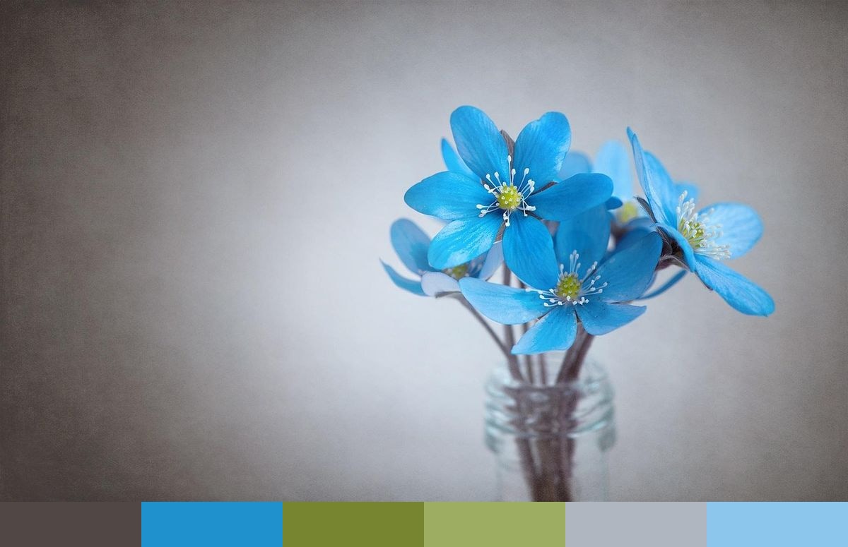
Credit: Pezibear on Pixabay
Colors in This Palette
The six colors — a dark warm neutral (#514744), sky blue (#1F91CC), moss (#778531), olive (#9DAD62), periwinkle (#AFB6C0), and powder blue (#8DC6EC) — capture the principal elements of the scene. The sky blue and powder blue represent the hepatica blooms at different depths of light; the moss and olive come from the green foliage; the neutral anchors the composition; the soft periwinkle reflects the blurred light in the background. The result is a palette with genuinely complementary tension between warm green and cool blue that feels pulled directly from the natural world.
Sponsors
Blue wildflower palettes are rare compared to warmer flower-sourced color sets, making this one particularly useful when a nature-based palette is needed but warmth must be avoided. It is an excellent choice for spring branding and seasonal campaigns, botanical illustration, nature and eco-product design, wellness and spa identity, interior styling in cool-toned rooms, and editorial design where natural freshness and clarity are primary goals.
The sky blue and powder blue tones can carry primary interactive and brand roles in a UI system, while the moss and olive serve as supporting accent and energy colors. The warm dark neutral works well for body text and dark-mode surface color. This palette reads cleanly as botanical and spring-inspired across both screen and print without requiring any adjustment between media.