Black and White Wedding Photo Color Palette
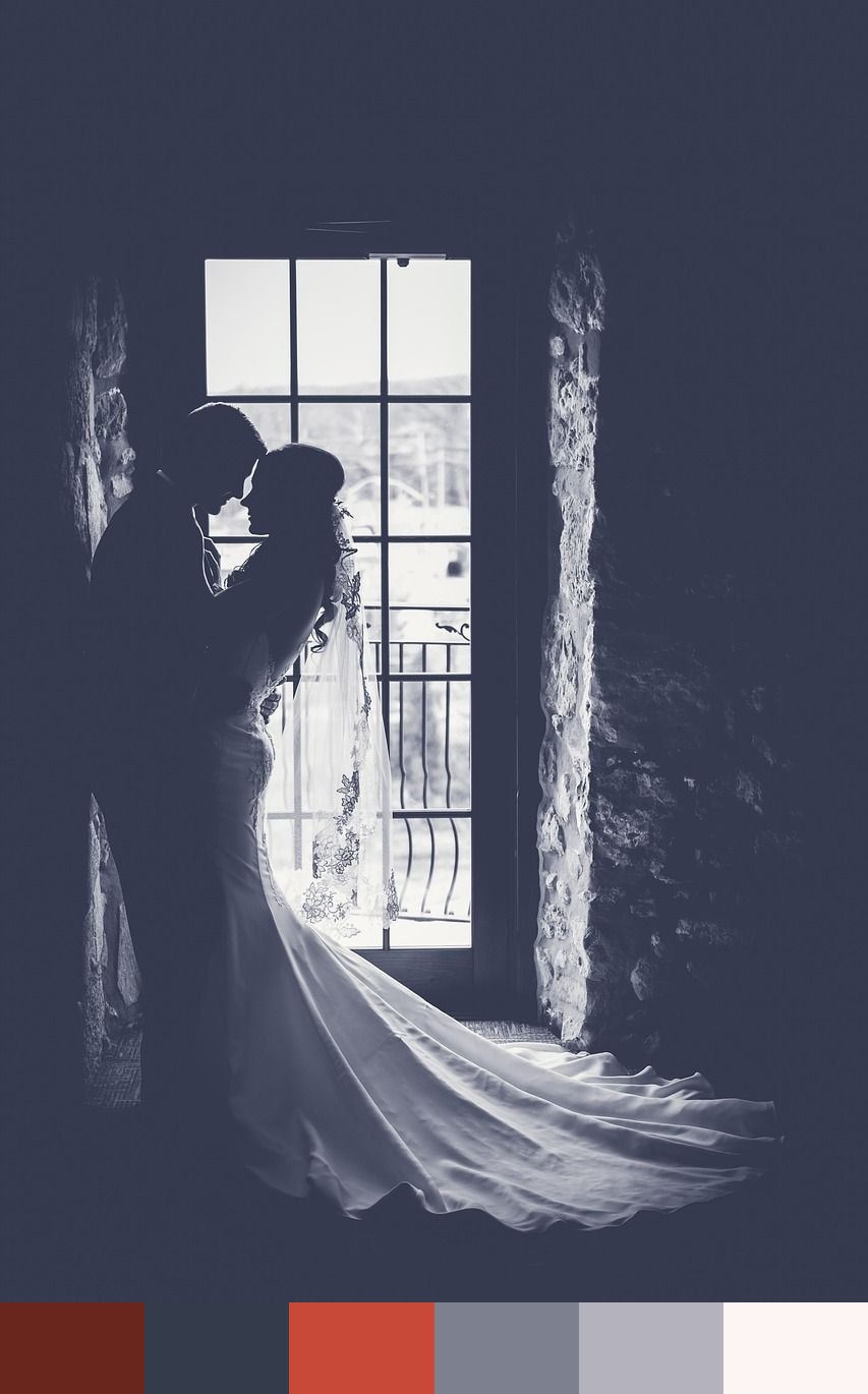
Despite the title, this photograph produces a surprisingly vivid color palette. The image shows a wedding couple — their silhouettes and forms captured in a way that amplifies the dramatic red and dark tones of the composition. Deep mahogany and a dark blue-navy emerge from shadow areas, a saturated brick red from the mid-tones, and progressively lighter cool grays, silver, and off-white rose from the highlights and background. It is a palette of strong contrasts that gives a wedding image an editorial, fashion-forward character.
Credit: Pexels on Pixabay
Colors in This Palette
The palette is built around a compelling tension between the warm earth of mahogany and red, and the cool detachment of navy, stone, and silver. The deep navy functions as a near-black anchor, while the mahogany adds warmth to that darkness. Red — at full saturation — commands attention when used even in small doses. Stone and silver step back as neutrals that add breathing room, and the near-white rose at the lightest end allows for clean, high-contrast compositions.
Sponsors
This palette is ideal for bold wedding branding, editorial fashion design, or any project that needs to communicate drama and sophistication simultaneously. Red and navy are a proven combination in formal wear and event design, while the mahogany and stone add a more nuanced, contemporary feel. Paired with cream or silver metallic paper, this palette makes a striking statement in wedding invitations or save-the-dates.
Beyond weddings, this set translates well to luxury product branding, menswear editorial layouts, and UI design for premium services where dark and authoritative palettes are appropriate. The red accent is versatile enough to serve as a call-to-action color in digital contexts, while the cooler grays and navy offer a sophisticated primary color system.