Aurora Borealis Color Palette
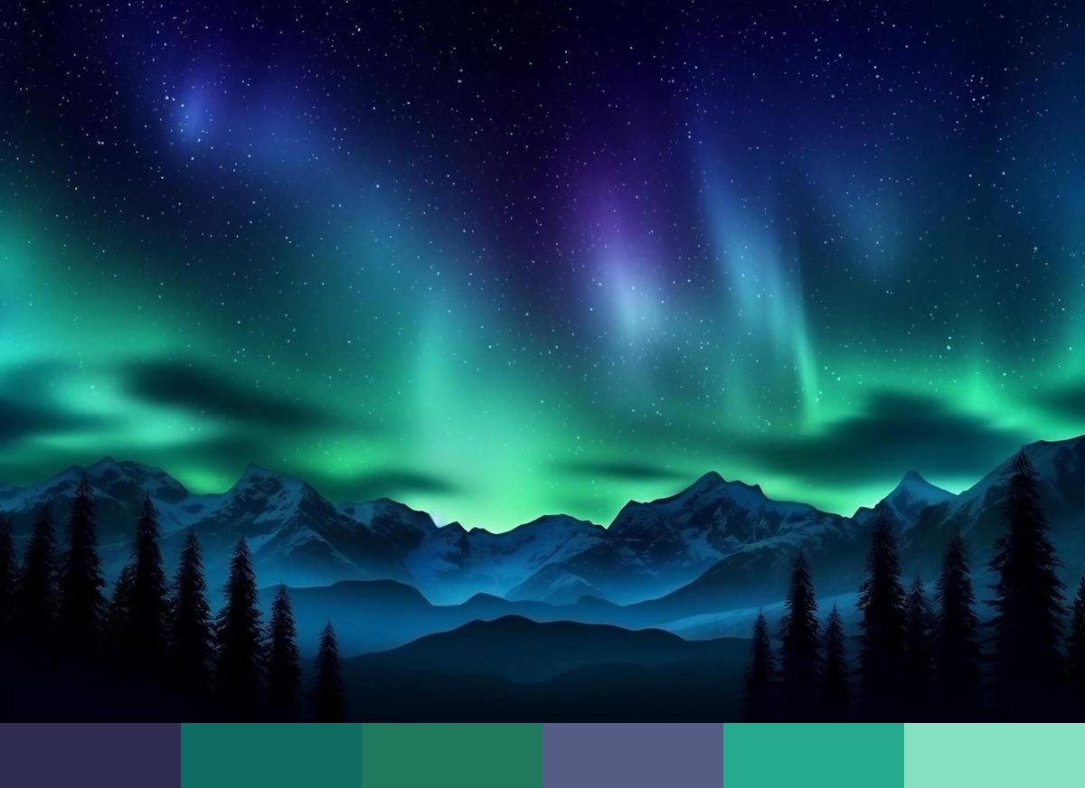
Drawn from a photograph, this palette captures the color range of the aurora borealis — navy, deep teal, deep teal 2, cobalt, teal, and seafoam. The tones shift from darker, more recessive shades to lighter, more open ones, reflecting the natural interplay of light and environment in the scene.
Credit: Creative Fabrica
Colors in This Palette
The Aurora Borealis palette is built from 6 shades — navy, deep teal, deep teal 2, cobalt, teal, and seafoam. Because these colors come from the same image, they share tonal relationships that make them easy to combine. The darker tones anchor a composition while the lighter shades provide warmth and contrast.
Palettes drawn from photographs are useful when you need colors that feel grounded rather than arbitrary. These shades work well for brand identity, illustration, UI color systems, mood boards, and any project where you want color that feels rooted in the natural world.